The Silver surge is getting a lot of attention this week. Many behind the curve commentators have suddenly awoken to the notion that Gold is not the only shining star in the metal mainstream
Here in the ForexFlow trading room, we have been locked long and loaded for sometime, waiting for the inevitable push higher. It certainly has been a dazzling push and performance. Even Gold was caught wearing shades.
The Gold to Silver ratio is a measure used to show how many ounces of Silver it takes to purchase an ounce of Gold. It was noticed that the ratio has been sitting at historical highs.- The highest value in nearly 30 years.. Using the historical presidence, everytime the ratio has become extreme – Silver has soared.
Armed with this nugget of statistical importance, a plan was developed, and future positioning, buy points and levels were plotted and mapped out.
The following charts show the journey from plan, to actionable trading positions taken…………….. and what a incredibly thrilling journey it has been thus far.
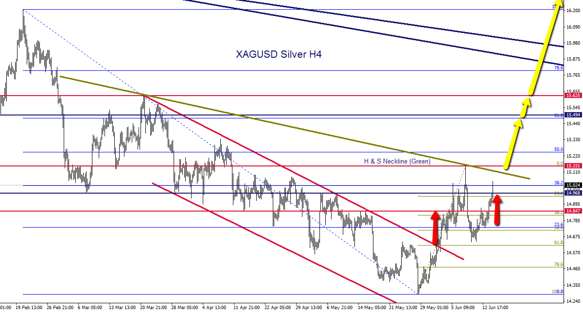
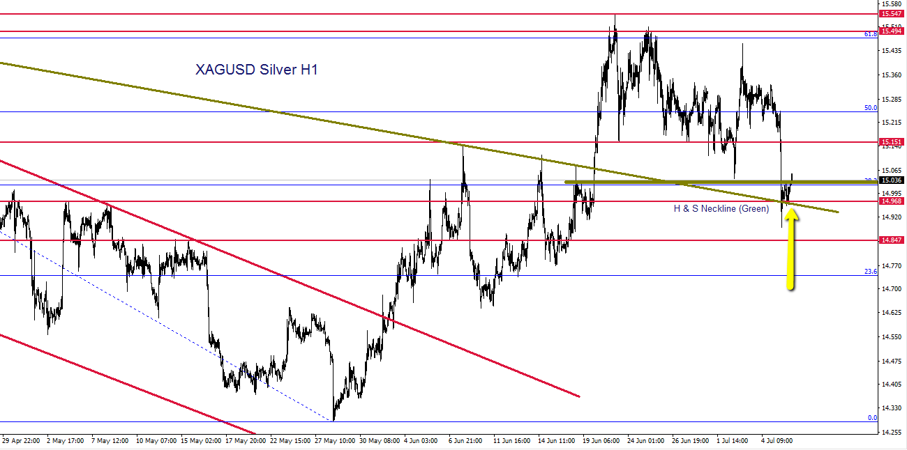
I recommend being a little cautious here at current levels. We have a major fib to contend with, and it would be heathy for price to consolidate at some stage, readying for the next leg higher. – Some levels are marked on the chart below as possible long entry areas on any pullbacks.
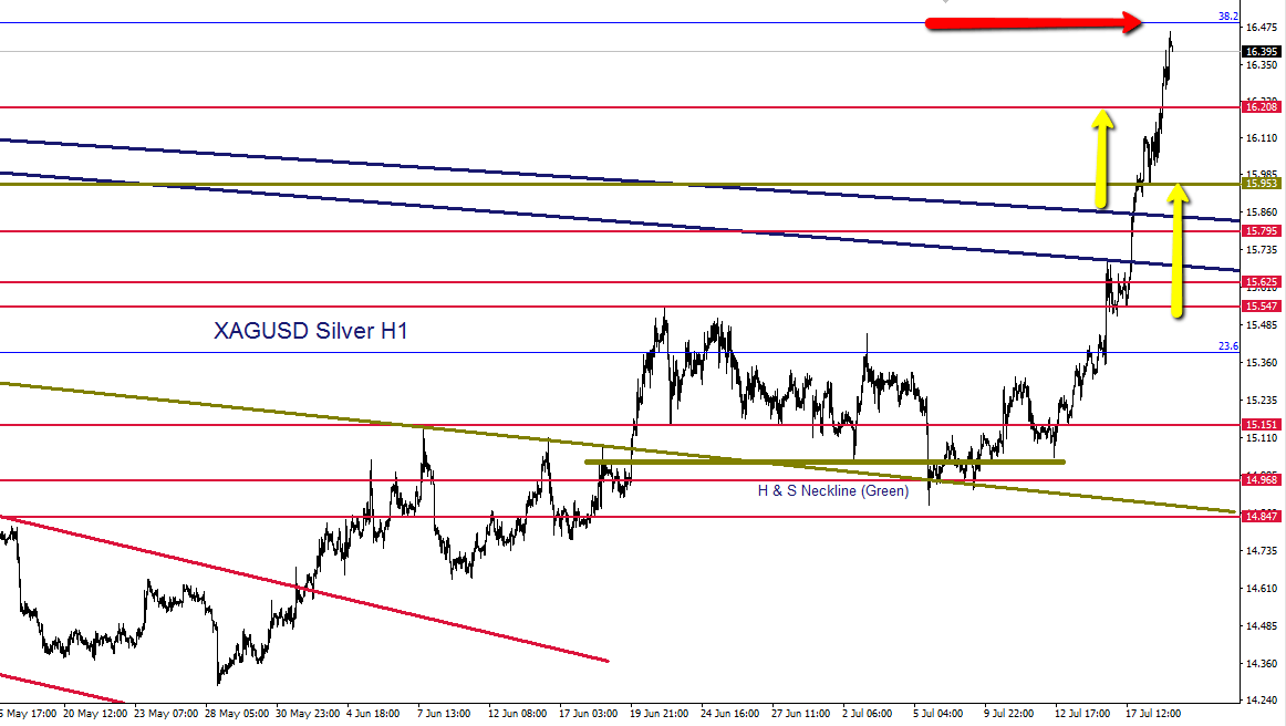
There is still over 30% of upside in the Silver price needed to balance the Gold-to-Silver ratio back to the historical average.
Please also forgive my absence from the Live Blog and here recently but the “Great Wall” has been clamping down and limiting my access. However, you can find me in our trading room regularly.


Philosophy: "Trading rules.....it most certainly does"
Read how Horatio got into trading here
- Silver – This weeks shining star, as predicted by ForexFlow - July 19, 2019
- 新年快乐 财源滚滚 大吉大利 A Happy wealthy healthy New Year to all our Chinese friends - February 4, 2019
- Gold and Silver – Glittering prizes? - January 28, 2019