
If you are anything like me, I often experience a psychological barrier when I notice the early indications of a new trend forming.
If you are not already committed with an open position in the new direction this can often cause you to step back, pause and evaluate (not a bad habit by any means). The first instinct is to wait and look for an opportunity to fade the move. This can prove fruitful for those of us with plenty of patience and discipline……..but what if the move keeps on going ?. I often have to remind myself that price trends for a reason. Often an accumulate number of reasons.
With this in mind it would be logical to attempt to jump in and trade the direction of the trend rather than await the next turn and the risks involved with top/bottom picking particularly strong price moves.
The beginnings of a new trend are very difficult to recognise. We can all (with the luxury of hindsight) look back at a chart and see the turns as clear as day using nothing more than the naked eye……..Assessing and spotting them in real time is not so easy.
There are ‘helpers’ we can use in the form of Indicators and Oscillators to gauge whether price is weakening ……Two are shown in the chart example below.– The CADJPY Hourly chart from last week.
Fig 1. — A 20 period smoothed Moving average can be useful, as can an RSI. If using an Hourly chart it is best to switch settings on the RSI to 20 rather than the standard 14 for this purpose. This will help smooth out value and make it easier to read. Another useful tip is to shade out the mid section from 40 – 60. This will cut out a lot of noise and fake moves around the 50 level and smooth further.
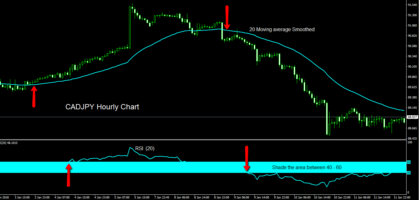
Fig 1
There are numerous ways to chart changes in direction. The above examples show indicators that are commonly used by many traders, yet none are ever going to give 100% consistent results. My preference is to count a series of lower lows / lower highs in the case of a Downward move (the opposite in Upward moves).
I have to endure a fair amount of good natured ribbing every-time I mention my ABC’s & D’s in front of my colleagues here on the ForexFlow site, yet they are an integral basis of many high percentage win ratio patterns such as the Gartley ‘222’ ,which is a whole new post we can visit at a future time.
Below in Fig 2…. I have set out an example of such a method using the same chart as above.
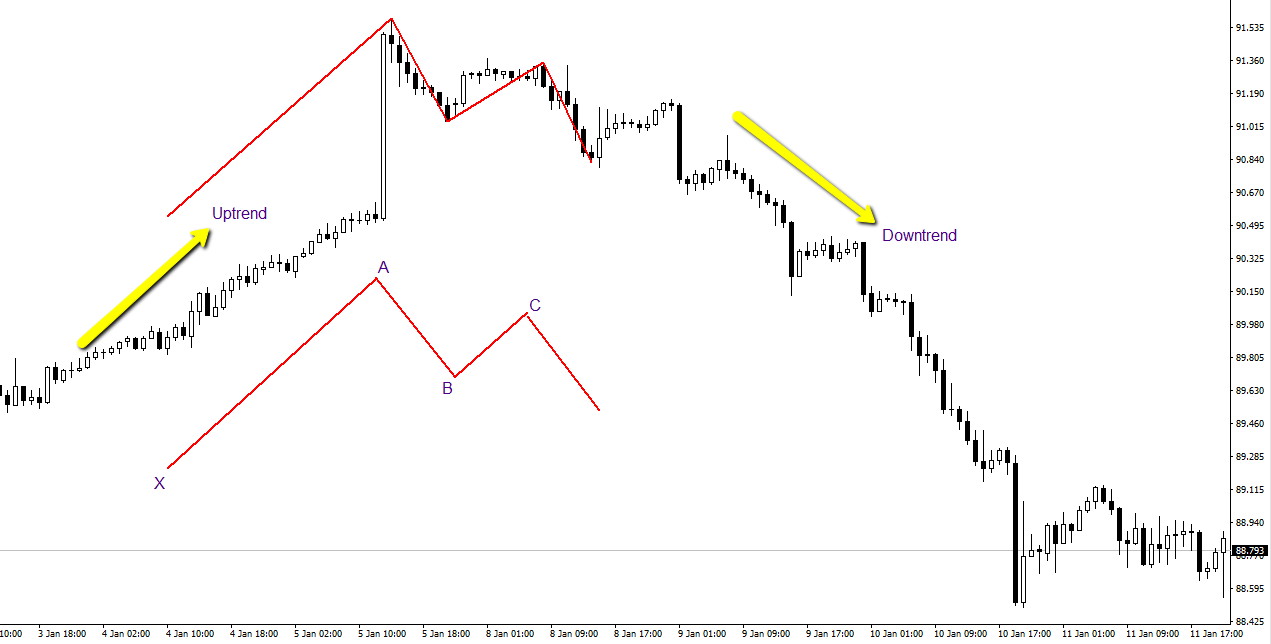
Fig 2
Once we have identified a possible change in trend, we can now set about the task of trading it ………..This is a method / strategy that I use at some point nearly every trading day.. I call it the Piercing Line Method. It is based around a single ‘Piercing’ Candle (green arrow on chart Fig 3) and its relation to the smaller swings in the direction of the trend.
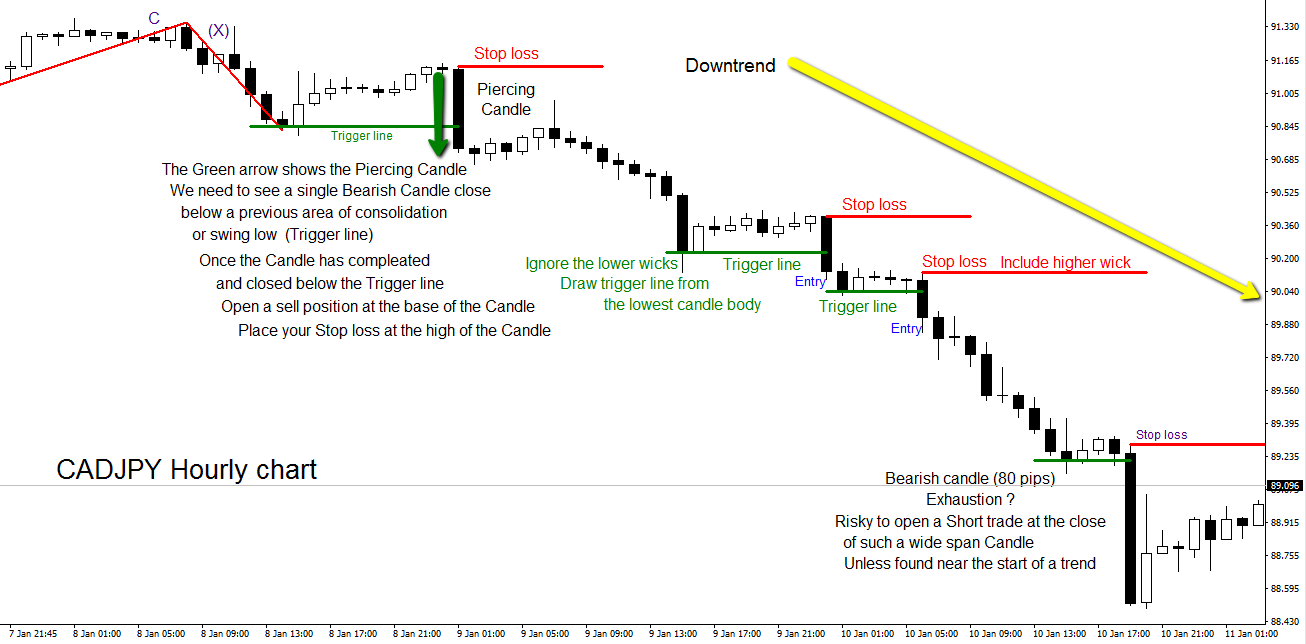
CADJPY Fig 3 The Piecing Candle
Fig 4 Shows the same Hourly chart of CADJPY in more detail. I have written the ‘rules of engagement’ on the chart so they are easy to follow in context with the visible price moves.– In a rising market you would simply reverse the strategy and use a Bullish Candle as your Piercing Candle and open your trade above overhead consolidation/ swing highs.
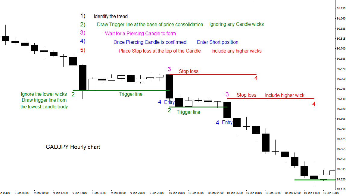
Fig 4 The Piercing line Method
There are no rules for exiting trades using the Piercing line Method . This is left up to the traders discretion. Once price is moving your way with tight stop loss intact at the close of the Candle, It’s a rather nice problem to ponder. You have the choice of viewing the trade as a singular intraday scalp – or layering and opening any amount of new positions in addition to your existing one in order to catch progressive steps in the trend.
Any questions or comments are always welcome.

Philosophy: "Trading rules.....it most certainly does"
Read how Horatio got into trading here
- Silver – This weeks shining star, as predicted by ForexFlow - July 19, 2019
- 新年快乐 财源滚滚 大吉大利 A Happy wealthy healthy New Year to all our Chinese friends - February 4, 2019
- Gold and Silver – Glittering prizes? - January 28, 2019
Mate that is one of the best tech analysis I have ever seen and more importantly able to follow.
Well done Horie, much appreciated
Seconded. Evidently this water diet works….
Really cleaned the old brain out……lol
🙂
Thank you so much for this TA!
Thank you so much for this TA!
You’re very welcome vitor
I’m enjoying this place!
An absolute barnstormer of a post H.
This is spot on;
“If you are not already committed with an open position in the new direction this can often cause you to step back, pause and evaluate (not a bad habit by any means). The first instinct is to wait and look for an opportunity to fade the move.”
That’s something I go through when not in a trade, and I know that it’s the bane of many a trader that often leads to the FOMO (fear of missing out) psychology, which can then also manifest itself into bad trades fighting the trend, because when folks think they’ve missed the only trade is to pick a top or bottom.
Hi Dubsy, super great stuff ;). If your as talented as a footballer I want you playing for the Hammers, would be title contenders :). Hope you and all are well I have not been around life does get in the way apologies to Ryan and all. atvb Chris
Hi Chris ….Lovely to hear from you !
That life stuff does tend to get in the way from time to time and far more important.
I’m actually crap at football………. but if you ever need someone to lie in front of the goal…… 🙂
Yep you never know what life has in store for you, a bit like fx Dubsy. We had a whole team that seemed like that till magic Moyes turned up so far anyway fingers crossed. atvb Chris
Hi Chris
Good to hear from you, hope you’re well and had a good Xmas & New Year?
Good to see you too Ryan Happy New year :). Someone said “the present is called the present cause its a gift” ;). Site is excellent going from strength to strength. The team are looking more like a team and winning happy days 🙂 atvb Chris
Thanks Chris
And yes, it’s nice to see us starting the New year well on the pitch.
Great stuff Dubs…..I had to read it twice because I swear you turned all moving averagy and you have 🙂